That Thing I Told You About (TYA)
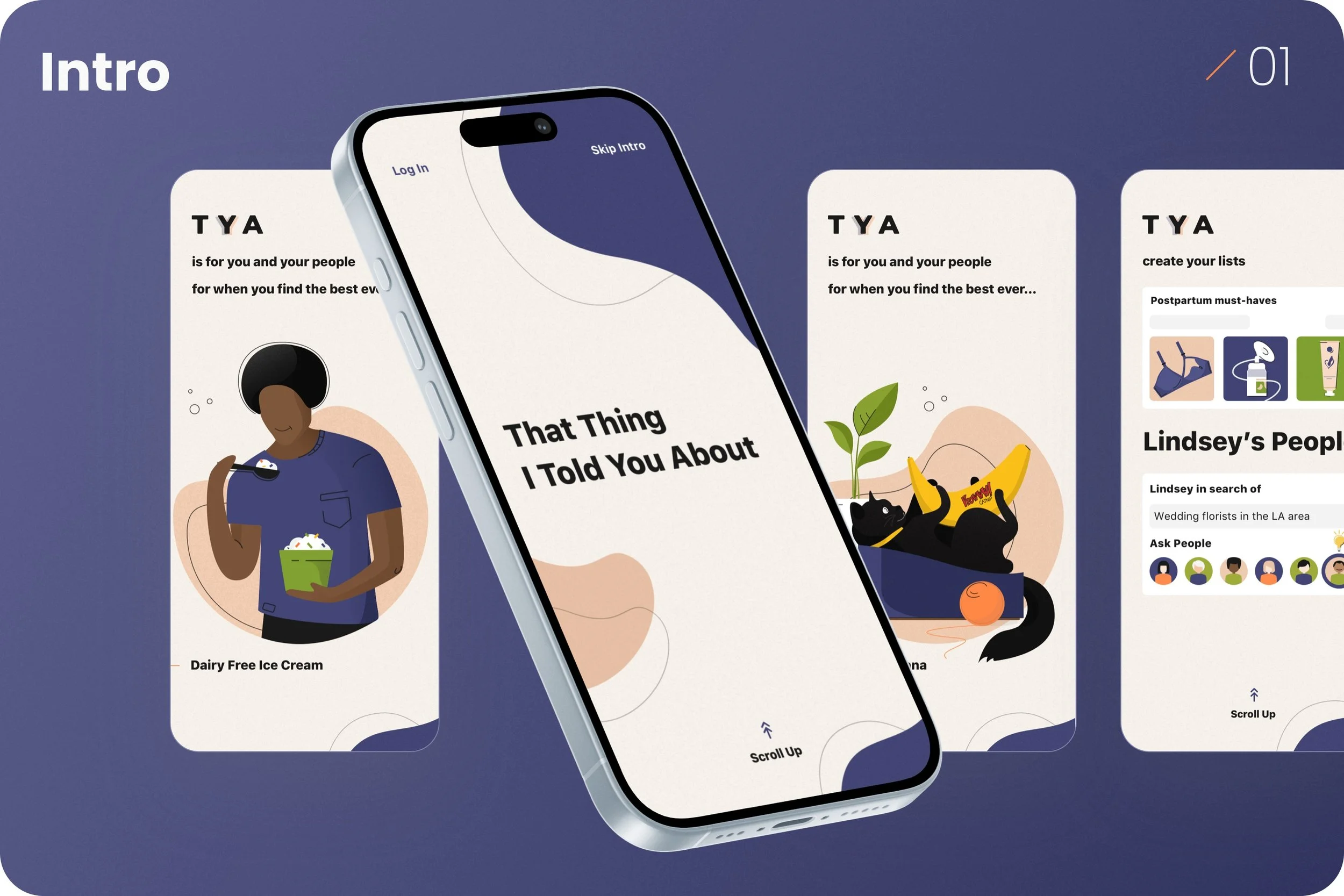
TYA gives users a place to make and share lists of favorite things, and to discover and receive recommendations from friends and like-minded people. Inspired by the lists we exchanged while expecting children (what you need, what you don’t), it also reflects the group texts we rely on for gift ideas, beauty finds, or travel tips—and all the recs we want to save and come back to.
About the project
What we’ve done
UX/UI Design
Web and Mobile Development
Project Management
Quality Assurance
From Vision to Reality
Great products don’t happen by chance. Through research, strategy, and design, we shape raw ideas into seamless experiences that make an impact.
Challenge
A WLCM Joy Labs project, TYA serves as a hub for all those things your friends say you’ve just gotta try/watch/read/listen to. It lives or dies by the network effect. Only by offering value will it become habitual to use and attract a community.
Solution
Through a simple and easy UX, we intend to create an experience that is so fun, functional and trustworthy that its audience grows itself, and so that we don’t need to sell ads, data, or subscriptions to monetize it.
Results
It’s too soon to tell. The TYA app is still in beta, so watch this space! In the meantime, we’d love your input. Click to request an invite below.
Design
Our main challenge: Building trust through truly relevant recommendations. For TYA to become the go-to app for sharing and discovering what people love, it must excel at showing users content that feels deeply personal and relevant. That means surfacing lists and recommendations not just from close friends, but also from people who share similar tastes, shopping habits, and values. At the same time, it must filter out irrelevant or low-quality content—because
one off-base suggestion can break the sense of trust. Unlike traditional feeds or recommendation engines, TYA isn’t about popularity—it’s about alignment. The better we can understand what makes someone them, the more accurate and useful their discovery experience becomes. Precision and personalization are key to making TYA feel like a curated, intimate space—not just another noisy platform.
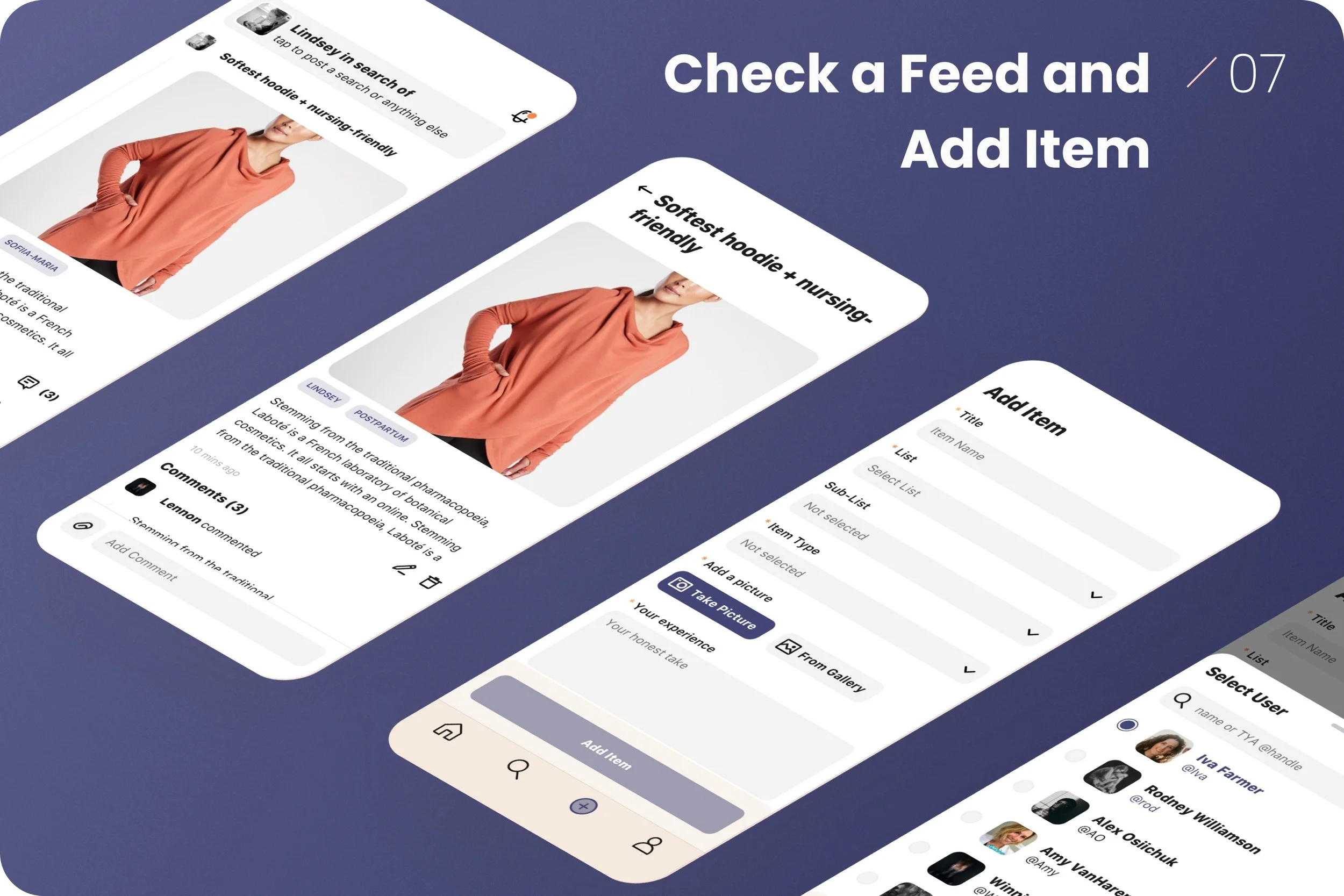
every interaction had to feel natural: users can tap into shared items, save favorites to their own lists, and invite their inner circle to join. Whether it’s a mascara your sister swears by or a podcast someone like you loves, TYA needed to feel instantly personal. The real challenge was creating a space where delight comes from relevance, simplicity, and that satisfying feeling of “Yes, this is exactly what I needed.”
Our second challenge: Designing a trusted, personal feed that users actually want to check. To make TYA a daily habit, we had to build a feed that felt as familiar and valuable as a text from your best friend. That meant showing users trusted recommendations—items shared by real people they know or those who match their tastes through a simple, friendly questionnaire. From there,
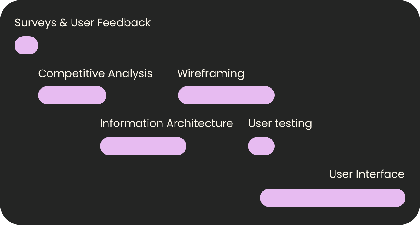
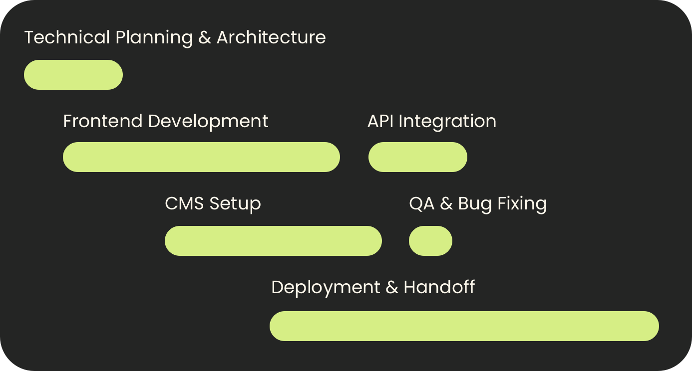
Project Roadmap
Design
Development
Ongoing Maintenance

That Thing I Told You About (TYA)
That Thing I Told You About (TYA) is a WLCM Joy Labs project — meaning we’re creating it for ourselves, for the challenge, and simply because we think it’s a great idea.
TYA gives users a place to make and share lists of favorite things and to receive and discover recommendations from friends and people like you. The app was inspired by the lists our friends shared with each other when we were expecting children (what you need, what you don’t, what’s worth the money), the conversations we’re always having on group text when we’re in the market (for a gift, mascara, denim), and all the recs we want to save (travel lists, best podcasts, the necessities we’re always refilling). With matchmaking, we’re supercharging the process by introducing users to friends they haven’t met yet; we want to make great discoveries happen.
With TYA, we’re creating a place to do the things we’re already doing more easily and better – this is, we believe, the best recipe for success in the app world.
Direct-to-consumer
iOS
Android
Commers
Joy labs
What we delivered
From Vision to Reality: We Bring Ideas to Life with Precision, Innovation, and Excellence.
Design
User interviews, beta tests and market research to validate user experience and functional decisions
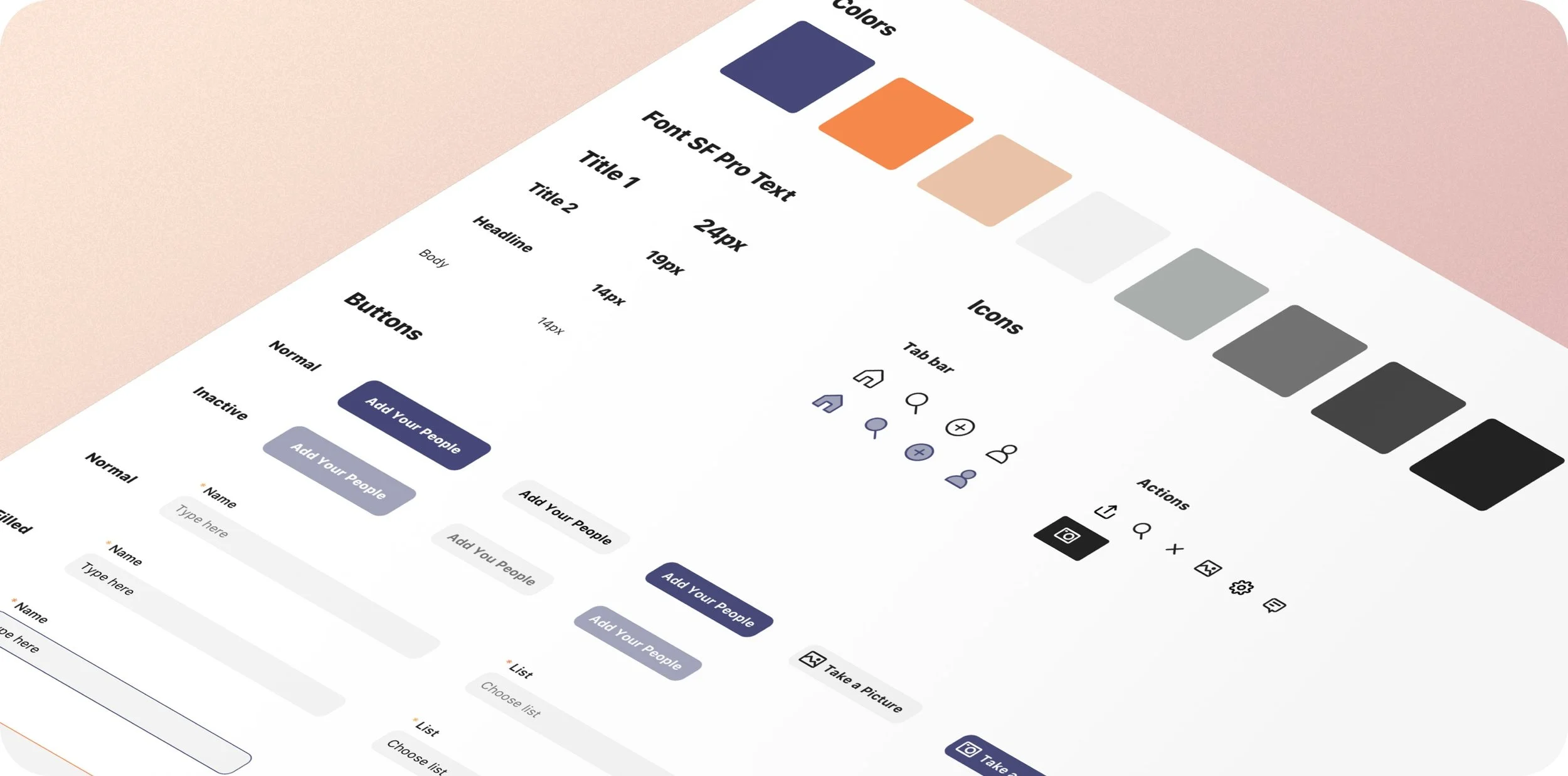
Simple, blue-themed brand design to let user content shine
Website with app preview and ability to sign up for waitlist
Backend admin panel to track KPIs and get gather user insight and business intelligence
UX/UI design for mobile apps on iOS and Android
Continuous iteration and design of new features
Development
Iterative, agile development process with a focus on fast releases to bring solutions and new features live for customers as quickly as possible
Team of two developers focusing on mobile front- and backend
Dedicated project manager and two quality assurance (QA) specialists
Two dedicated UX/UI designers
Continuous iteration and development of new features
Tech Stack
Frontend
Angular // framework
Redux
Typescript
Backend
MongoDB with Mongoose // Database with ORM
Firebase // for short links
Nest.js // Framework for Node.js
Redis // for caching
AWS S3 // for storage
AWS SES // for mailing
Twilio // for SMS
Docker // for containerization
Swagger // for API docs
Mobile
React Native // cross-platform mobile framework
React-navigation
Firebase (dynamic links, crash analytics)
React-native-reanimated
Redux-Saga, React-Query // store, state-managment
Lodash // utility library
Dayjs // date processing & manipulation
react-native-image-crop-picker JS // picture processing
libphonenumber-js, Formik, Yup // input masking, validations
Core Features
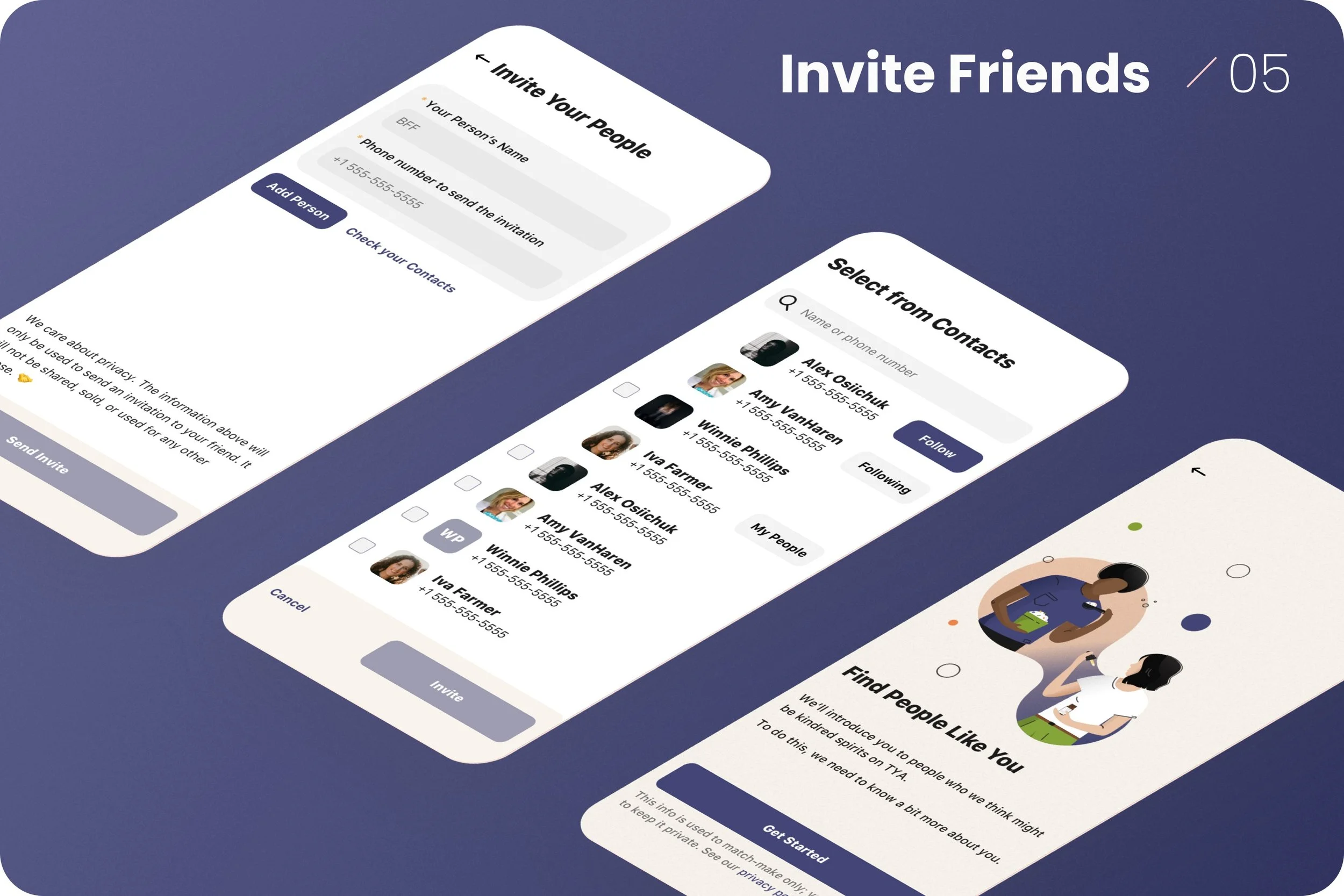
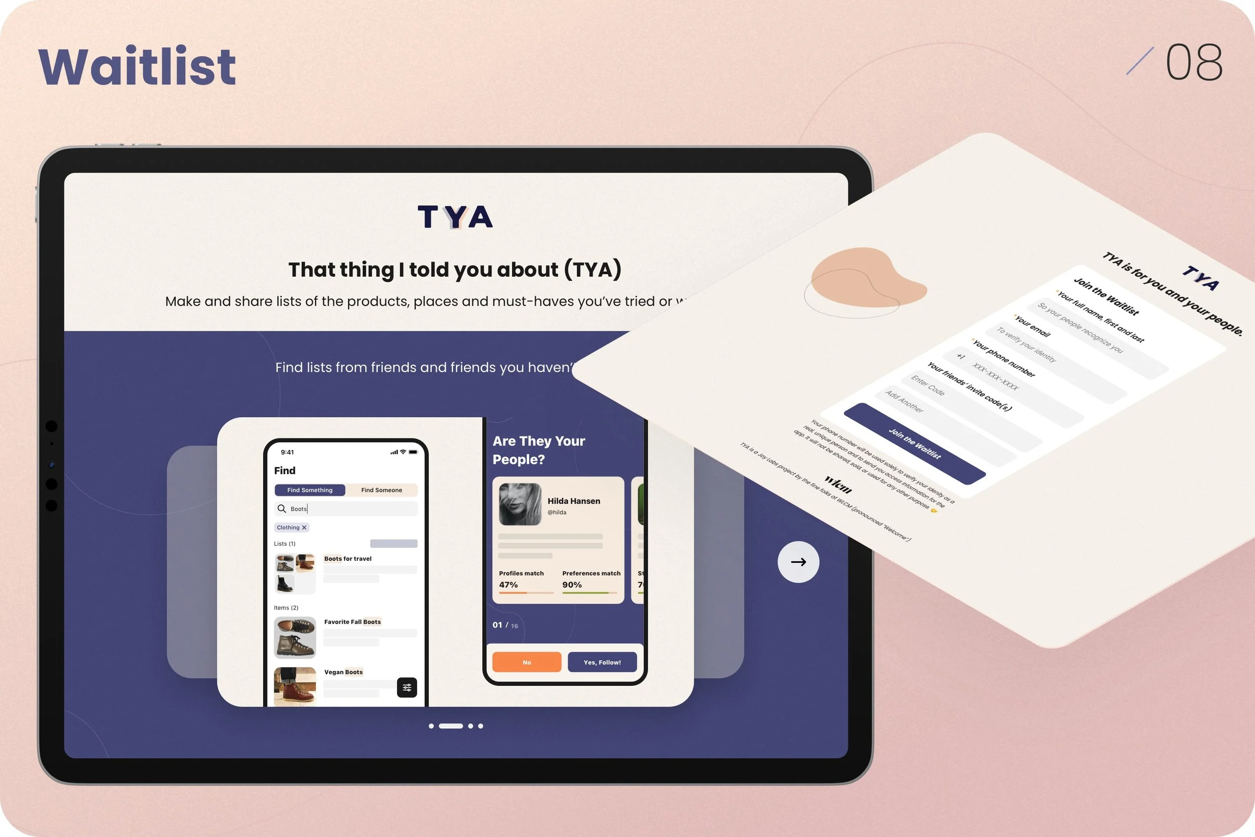
Website with mobile app preview and ability to request an invite to the app, get your invite code, and connect with your friends even before getting the app
Admin Web-based app with ability to invite users and their connections ad hoc from the waitlist, watch and measure KPIs, and gather business intelligence
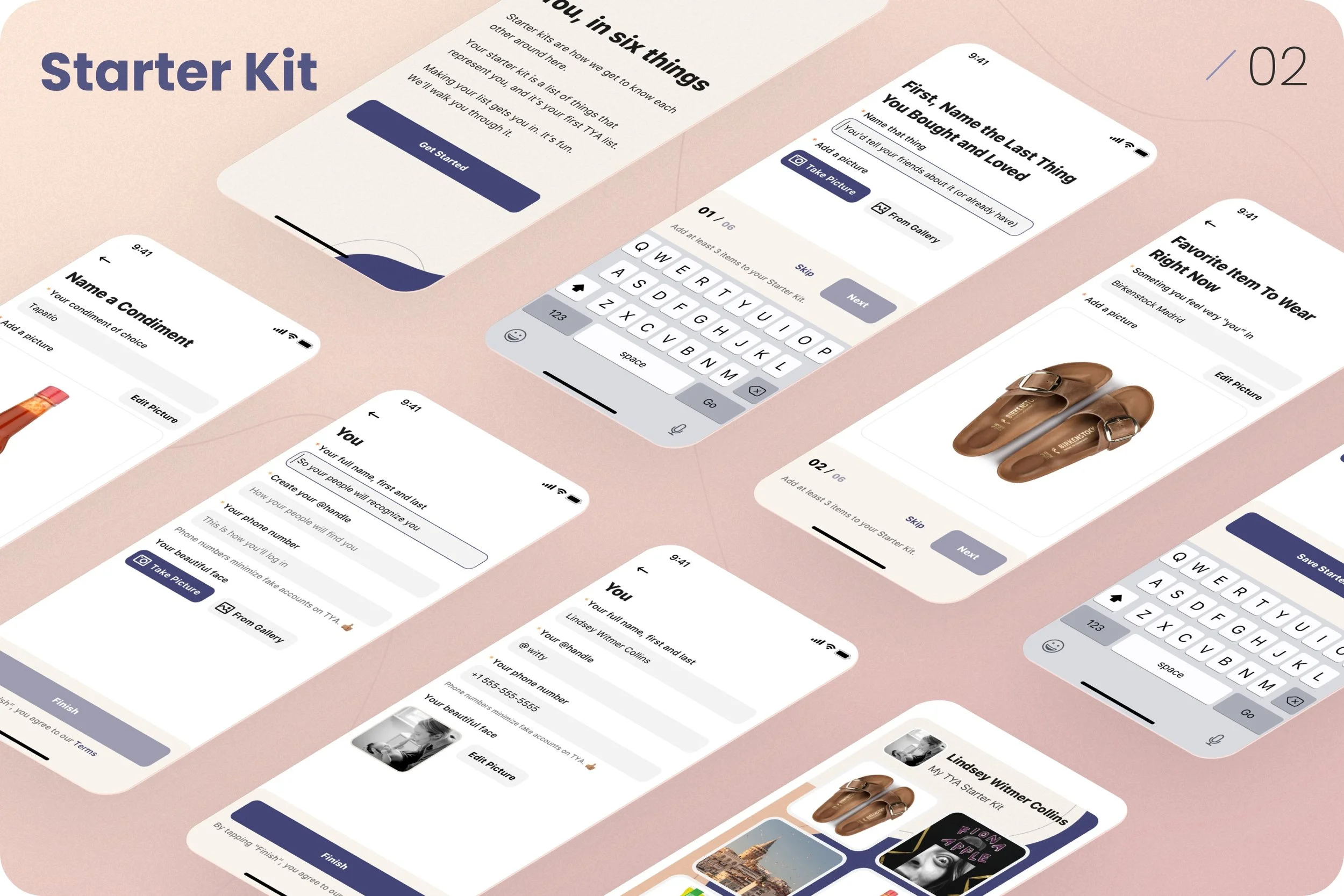
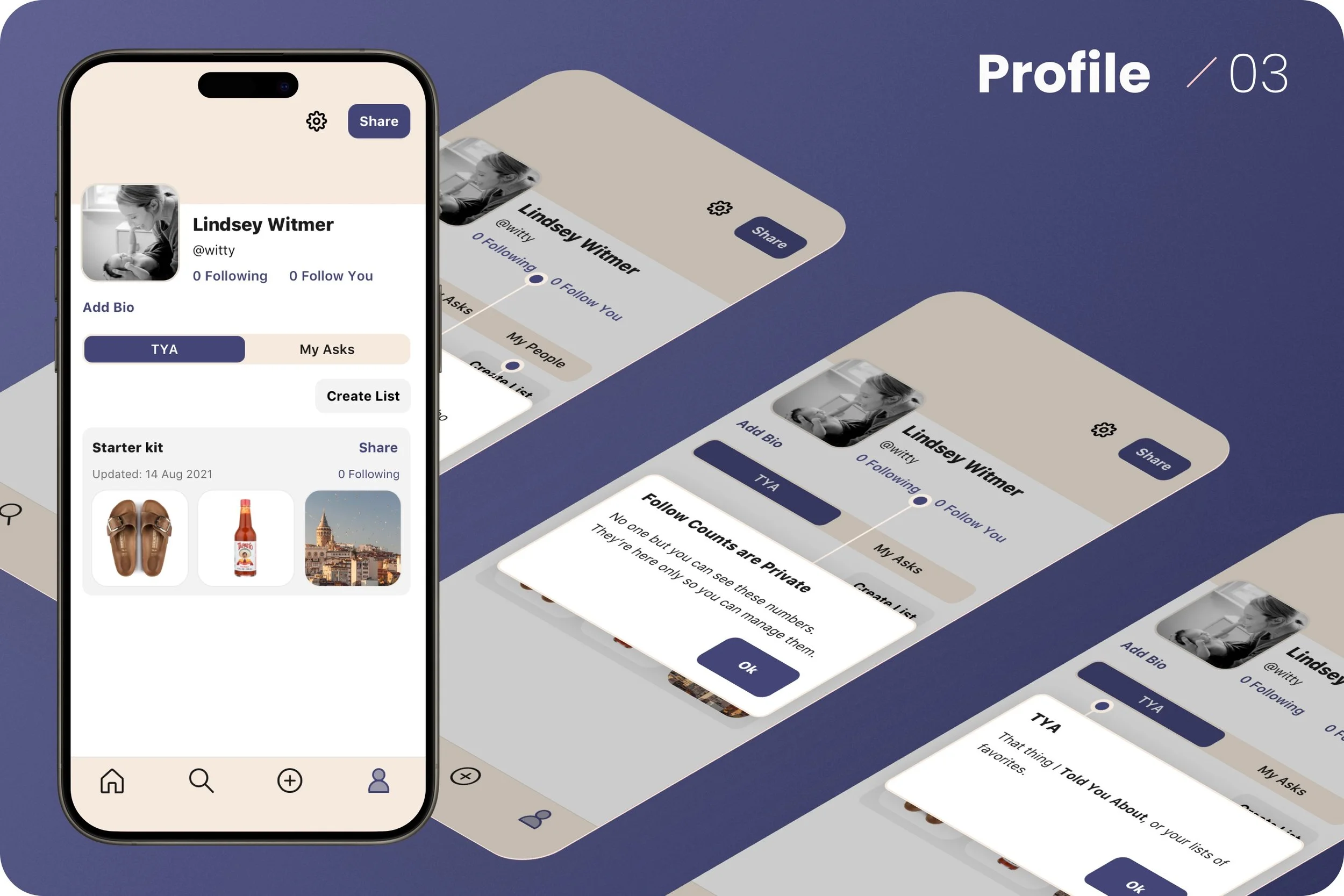
“Starter kits” that users can create and share to express themselves and their preferences
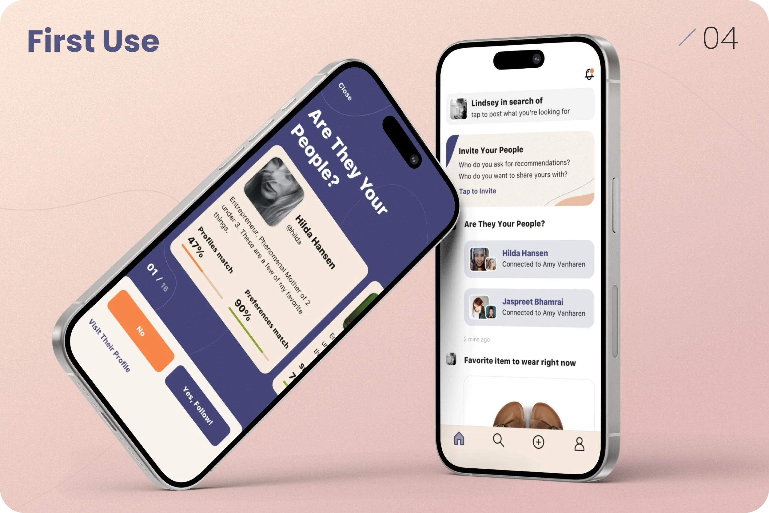
Matchmaking by profiles and preferences for product discovery and new connections
Search, share and comment on products, lists, and profiles
Ask your connections for recommendations

Elias Bizannes, Crowd Cure
Her general intelligence, emotional intelligence, and curiosity make her one of the best people I’ve ever worked with on a creative project.
Lindsey is a product genius that likes to get things done. Her general intelligence, emotional intelligence, and curiosity makes her one of the best people I’ve ever worked with on a creative project. She took my vision of the future and turned it into a product — first as a prototype that enabled me to raise investment money, and now an MVP (Minimal Viable Product) that we are taking to the market. Not only is this high quality product work that we are getting (even by my Silicon Valley standards), but the professionalism of herself and her team make working with LWC a delight.


